In this article, I'll show how to add another dimension to your web pages and applications with the new 3D transformation functions and properties in CSS. We'll look at transform, translate, rotations, scaling, perspective and more, along with issues to do with z-index, browser gotchas, and the best use cases for these functions.
HTML elements can be transformed in three dimensions:
- the horizontal x-axis
- the vertical y-axis, and
- the depth z-axis
On a two-dimensional screen, it's useful to think of the surface being at z co-ordinate zero. A positive z-value moves an object toward you (in front of the screen) while a negative z-value moves an object away (behind the screen). When perspective is added, a more distant z-value can cause the object to disappear entirely.
There are some things to note here:
- CSS can only transform two-dimensional HTML elements in three-dimensional space. The elements themselves remain flat and have zero depth. It’s possible to scale in the z-plane, but that will not extrude a square into a cube. You can still create a cube, but would need six elements to make each side.
- CSS 3D transformations are great for page effects — but don't expect that you'll be able to create the next MineCraft or Call of Duty. Complex models are better implemented using a technology such as WebGL.
3D transformations are well-supported in all modern browsers (IE10+), but:
- Internet Explorer doesn’t support
transform-style: preserve-3d, which makes it impossible to create a 3D scene. - All versions of Safari must use the vendor-prefixed
-webkit-backface-visibilityto hide rear faces. All other browsers supportbackface-visibility.
The following sections describe the 3D transformation properties and functions. The demonstration page illustrates how most are used.
The transform Property
Any element can have a single transform property applied. It can be assigned a function with one or more parameters. For example:
.element {
  transform: function1(parameter1, [...parameterN]);
}
If two or more transformations are required, any number of space-separated functions can be defined:
.element {
  transform: function1(p1, [...pN]) function2(p1, [...pN]);
}
For example, to scale in the horizontal plane and transform vertically:
.element {
  transform: scaleX(2) translateY(50px);
}
Finally, transform: none; removes all existing transforms.
Translation (Moving) Functions
You have possibly used translate functions to move an element horizontally along the x axis or vertically along the y axis:
transform: translateX(50px);        /* 50px to right */
transform: translateY(-100%);       /* 100% up */
transform: translate(50px, -100%);  /* both together */
Any length unit can be used. Percentages reference the size of the transformed element so a 100px high block with translateY(80%) applied moves it down by 80 pixels.
Moving into the third dimension, we can also use translateZ:
transform: translateZ(-200px); /* 200px 'into' the screen */
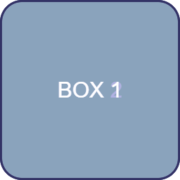
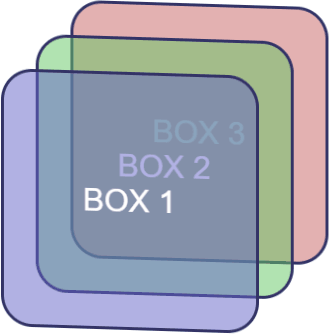
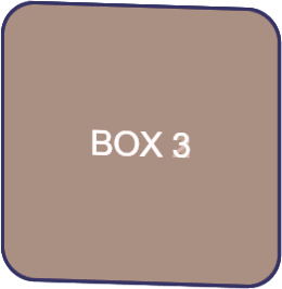
Given three elements, #box1, #box2 and #box3, absolutely positioned in the same place, with translateZ(-200px) applied to #box2 and translateZ(-400px) applied to #box3. The result is fairly uninspiring:
However, if we rotate the whole outer #scene container, the z-axis transformations become more evident:
#scene {
  transform-style: preserve-3d;
  transform: rotateX(-10deg) rotateY(-10deg);
}
The shorthand translate3d function allows an element to be moved along all three axes accordingly:
transform: translate3d(50px, 100%, 7em); /* x, y, z axis */
transform-style Property
By default (and always in IE), transform-style is set to flat. This indicates that all transformed children of an element lie in the plane of the element itself. In other words, inner elements could have any transform applied but they would be squashed into the flat plane of the container:
In most situations, transform-style: preserve-3d; must be used to indicate the child elements are positioned in 3D space and any transformation of the container will transform all accordingly.
The post 3D Transformation Functions in CSS appeared first on SitePoint.


